The Beginner's Guide to Creating Gaussian Curves in Excel

The Beginner's Guide to Creating Gaussian Curves in Excel

The Beginner's Guide to Creating Gaussian Curves in Excel

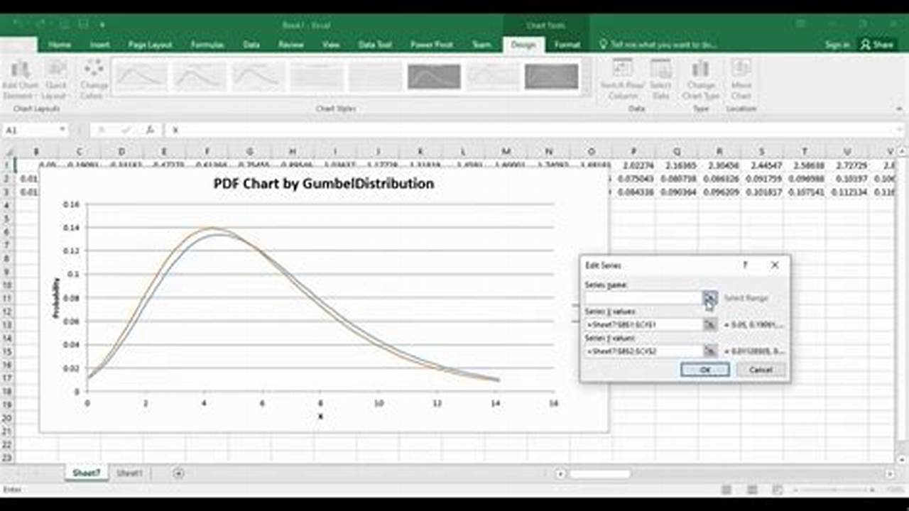
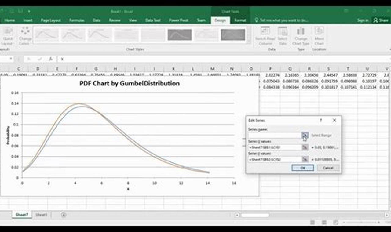
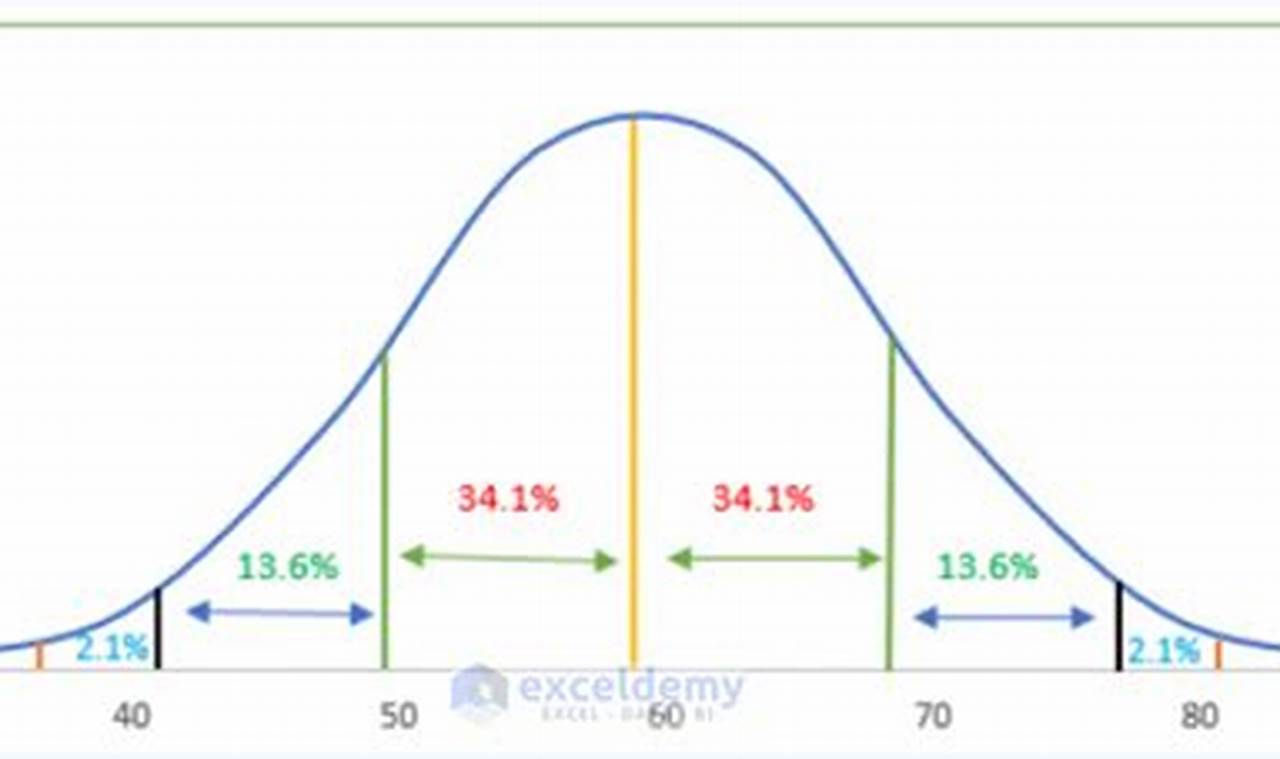
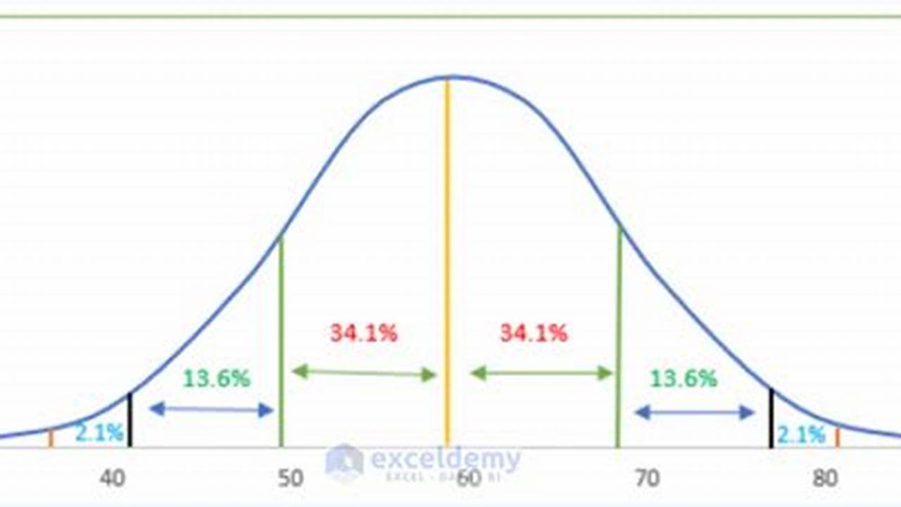
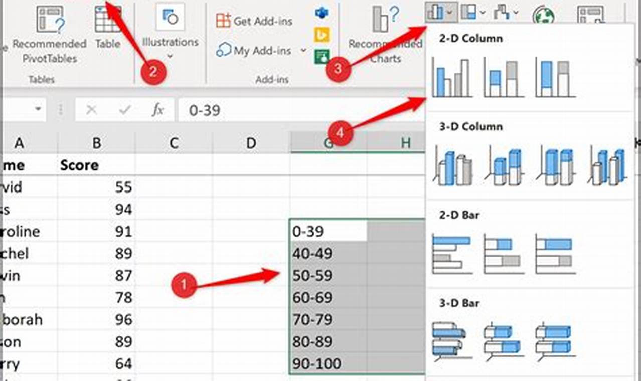
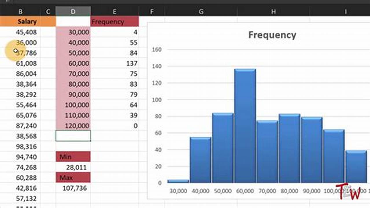
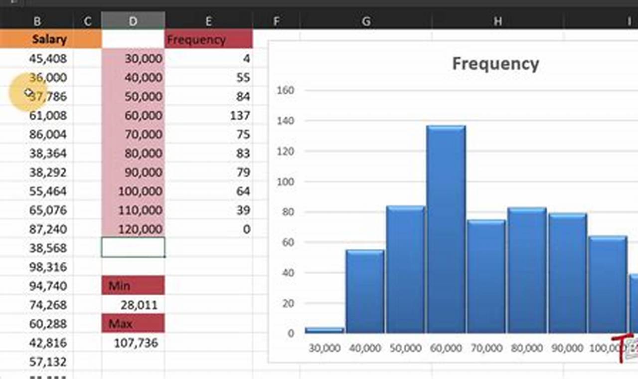
A Gaussian curve, also known as a normal distribution curve, is a bell-shaped curve that represents the probability of a given value occurring in a population. It is often used in statistics to model the distribution of data, such as heights, weights, and test scores.

To make a Gaussian curve in Excel, you can use the NORMDIST function. This function takes three arguments: the mean, the standard deviation, and the value you want to calculate the probability for.

Read more

How to Craft a Histogram in Excel: A Comprehensive Guide

How to Craft a Histogram in Excel: A Comprehensive Guide

How to Craft a Histogram in Excel: A Comprehensive Guide

A histogram is a graphical representation of the distribution of data. It is a type of bar graph that shows the frequency of occurrence of different values in a dataset. Histograms are used to visualize the shape of a distribution and to identify patterns and trends in the data.

Histograms are important because they can help us to understand the distribution of data and to make informed decisions. For example, a histogram can be used to determine the average value of a dataset, to identify the most common values, and to find outliers. Histograms can also be used to compare different datasets and to identify trends over time.

Read more

How to Easily Insert and Use the Dollar ($) Symbol in Excel

How to Easily Insert and Use the Dollar ($) Symbol in Excel

How to Easily Insert and Use the Dollar ($) Symbol in Excel

The dollar sign ($) is used in Excel to indicate an absolute reference to a cell. This means that the reference will not change when the formula is copied or moved to another location in the worksheet. To create an absolute reference, simply precede the cell reference with a dollar sign. For example, the formula =$A$1 will always refer to the value in cell A1, even if the formula is copied to another cell.

There are several benefits to using absolute references in Excel. First, they can help to prevent errors when formulas are copied or moved. For example, if you have a formula that calculates the sum of a range of cells, and you copy the formula to another cell, the range of cells that the formula refers to will change if the original range of cells is not absolute. This could lead to incorrect results.

Read more

The Ultimate Guide to Merging Columns in Excel: A Step-by-Step Tutorial

The Ultimate Guide to Merging Columns in Excel: A Step-by-Step Tutorial

The Ultimate Guide to Merging Columns in Excel: A Step-by-Step Tutorial

Merging columns in Microsoft Excel combines data from two or more columns into a single column. This technique is commonly used to consolidate related information, remove duplicate data, and improve data organization.

Merging columns offers several benefits. It can streamline data analysis by presenting all relevant information in one column, making it easier to identify patterns and trends. Additionally, merging columns can reduce the risk of errors by eliminating the need to manually copy and paste data, which can lead to inaccuracies.

Read more

A Comprehensive Guide to Convert Mail to Excel Using Open Source Tools

A Comprehensive Guide to Convert Mail to Excel Using Open Source Tools

A Comprehensive Guide to Convert Mail to Excel Using Open Source Tools


Converting Mail to Excel using Open Source Tools refers to the process of transforming email messages and their contents into the Microsoft Excel spreadsheet format. This conversion enables users to seamlessly import, organize, and analyze email data within the familiar Excel environment.

The benefits of converting mail to Excel include enhanced data manipulation and analysis capabilities, improved data visualization through charts and graphs, and simplified data sharing and collaboration. Historically, this conversion was performed manually or through proprietary software, but the advent of open source tools has made the process more accessible and efficient.

Read more

The Ultimate Guide to Crafting Frequency Graphs in Excel: A Step-by-Step Blueprint

The Ultimate Guide to Crafting Frequency Graphs in Excel: A Step-by-Step Blueprint

The Ultimate Guide to Crafting Frequency Graphs in Excel: A Step-by-Step Blueprint

A frequency graph or distribution graph in Microsoft Excel is a type of chart that displays the frequency of data points within specified intervals. The x-axis represents the intervals, and the y-axis represents the frequency of occurrence. This type of graph is commonly used to visualize the distribution of data, identify patterns, and make inferences about the underlying population.

Frequency graphs are particularly useful for analyzing large datasets, as they provide a clear and concise visual representation of the data distribution. They can help identify outliers, gaps, and other patterns that may not be apparent from a simple list of data points.

Read more

How to Make Your Excel Dashboards Look Modern and Professional [Step-by-Step]

How to Make Your Excel Dashboards Look Modern and Professional [Step-by-Step]

How to Make Your Excel Dashboards Look Modern and Professional [Step-by-Step]

Making your Excel dashboards look modern can help you communicate your data more effectively and engage your audience. Here are a few tips:


Use a modern template. There are many free and paid templates available online that can give your dashboard a modern look and feel.Use a consistent color scheme. Choose a color scheme that is easy on the eyes and that complements your brand.Use clear and concise fonts. Avoid using too many different fonts or font sizes.Use data visualization techniques. Charts and graphs can help you present your data in a visually appealing way.Add interactivity. Allow your users to interact with your dashboard by adding features such as filters and drill-downs.

Read more

Master Excel: Effortless Column Manipulation | How to Move Excel Columns Like a Pro

Master Excel: Effortless Column Manipulation | How to Move Excel Columns Like a Pro

Master Excel: Effortless Column Manipulation | How to Move Excel Columns Like a Pro

Moving columns in Excel is a common task that can be done in a few different ways. The most common way to move a column is to click on the column header and drag it to the desired location. Another way to move a column is to use the cut and paste commands. To do this, select the column you want to move, right-click and select Cut. Then, click on the location where you want to paste the column and right-click and select Paste.

There are several benefits to moving columns in Excel. First, it can help you organize your data more effectively. By moving columns around, you can group related data together and make it easier to find the information you need. Second, moving columns can help you create a more visually appealing spreadsheet. By moving columns around, you can create a layout that is more pleasing to the eye and easier to read.

Read more

Easy Guide: Calculating Density from an Excel Graph

Easy Guide: Calculating Density from an Excel Graph

Easy Guide: Calculating Density from an Excel Graph

Determining the density of a substance is a crucial aspect of many scientific and industrial applications. A convenient and efficient way to calculate density is by utilizing a graph created using Microsoft Excel. Density, denoted by the Greek letter (rho), is defined as the mass per unit volume of a substance and is expressed in units of kilograms per cubic meter (kg/m).

The formula to calculate density is:
= m/V
where:
is density in kg/m
m is mass in kilograms (kg)
V is volume in cubic meters (m)

Read more